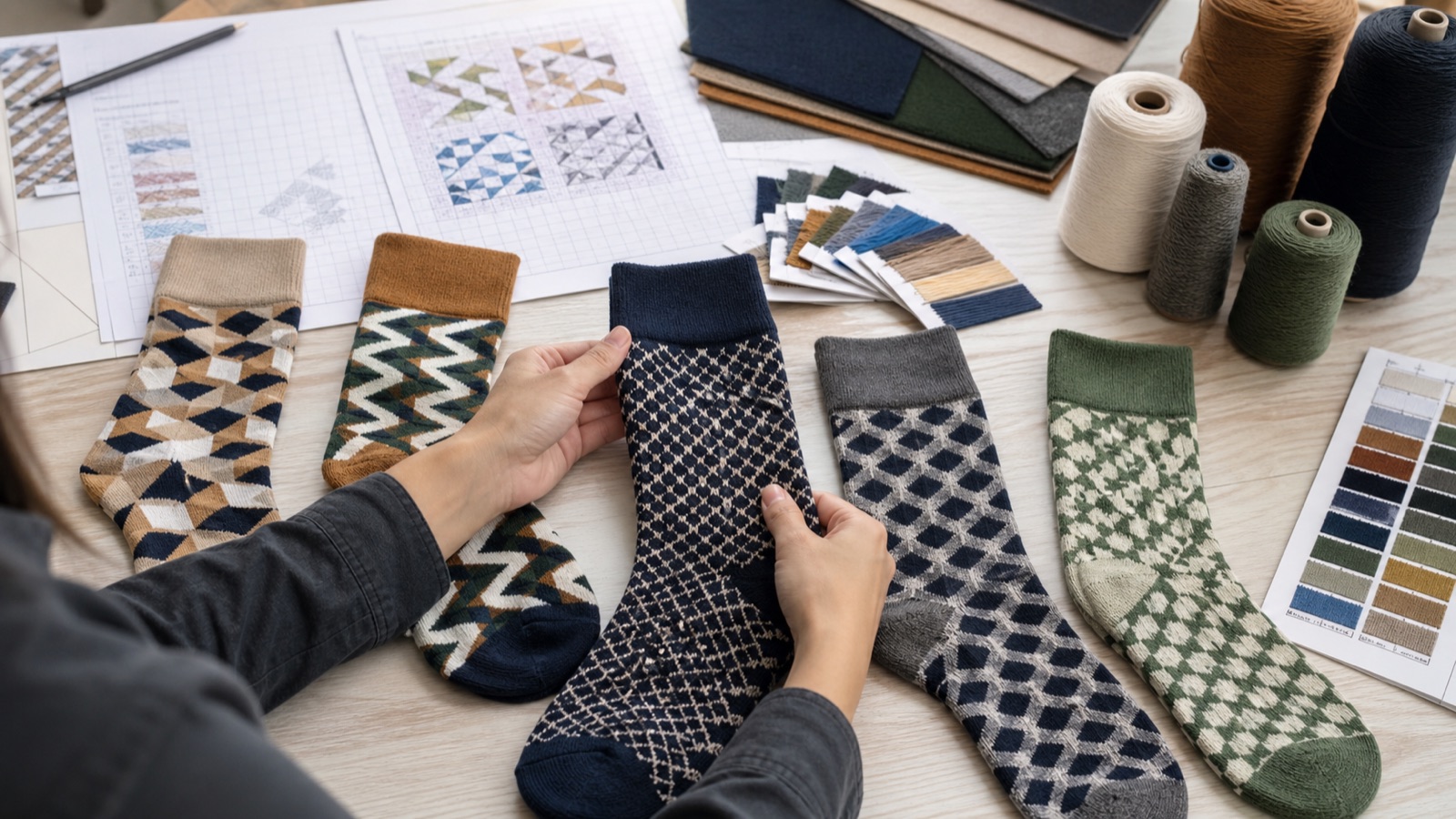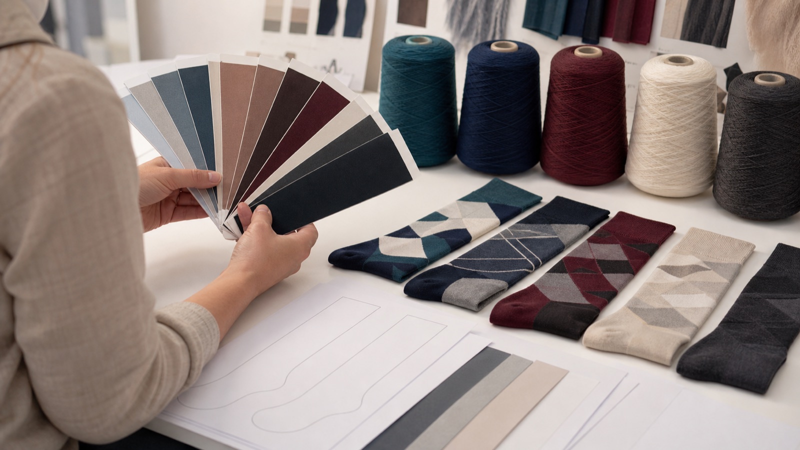
Use a shared color reference
Digital screens vary, so an RGB or hexadecimal value is not enough for physical yarn approval. Provide a recognized color reference or physical sample when the shade is important. State which colors are brand-critical and which may use the closest available yarn.
Review color under appropriate light and on the actual knitted construction because texture and neighboring colors affect perception.
Prepare artwork for knitting
Vector files are preferred for logos and motifs because they can be scaled cleanly. Fonts should be outlined or supplied correctly, and gradients may need conversion into solid-color areas.
- AI, EPS, SVG or editable PDF when possible
- Outlined fonts
- Named color references
- Placement and target dimensions
- Separate files for each approved variant
Respect stitch resolution
Small text and thin lines can disappear or become uneven. Ask the manufacturer for a knit simulation or sample and be willing to simplify details. A clearer logo usually creates stronger brand recognition than a technically exact but unreadable reproduction.
Check the design both relaxed and on foot because stretch changes proportions.
Control revisions
Number every artwork version and consolidate stakeholder feedback. Record approved scale, placement and color together with the product specification.
When reordering, send the approved code and confirm whether any yarn batch or machine change requires a new color review.
Reduce approval risk with a color hierarchy
Classify colors as critical brand matches, important collection colors or flexible supporting shades. This helps the supplier focus custom dyeing and physical approvals where they matter most.
For each approved shade, record the reference system, yarn code, viewing condition and sample style. A color approved on one texture may still need review on another knit construction.
- Rank color importance
- Record physical references
- Review colors on the target knit
- Control yarn changes on reorders
Color and artwork handoff checklist
Digital screens display color differently, so production approval should use recognized references, available yarn cards or physical samples. Identify critical brand colors and acceptable supporting shades.
Artwork files should explain placement, repeat, orientation and scale for every relevant size. A knitted strike-off or sample is the most reliable point for final visual approval.
- Provide vector logo and pattern files
- Name critical color references
- Mark placement and finished dimensions
- Review artwork on the intended sizes
- Archive approved yarn and sample references
Frequently asked questions
Can sock yarn exactly match a screen color?
A screen value is not a physical standard. Use a recognized color system or material sample and allow for how yarn texture and adjacent colors affect perception.
Which file format is best for custom sock artwork?
Editable vector artwork is preferred for logos and repeats. Include fonts or outlined text, color references and a clear visual showing intended placement.
Why must artwork be checked in multiple sizes?
Stitch counts and proportions can change across sizes. A motif may need controlled scaling or placement adjustments to remain recognizable.
Plan your custom bamboo sock project.
Clear artwork and physical color standards reduce sample rounds and production ambiguity. Send your brand files and target sock construction for a knit-readiness review.
Specifications, claims, testing, labeling and compliance should be confirmed for the exact product and destination market. This guide is general sourcing information, not legal or medical advice.